Top 10 Fonts Used By Professionals In Graphic Design
Want to learn about the fonts used by professionals? This article contains the best fonts used by professionals in graphic design.
Designing a form of communication with visuals in a combination of artistic elements and typography conveys the right message. For this, font style is important as it can alter the viewers’ feelings.
If you have ever wondered what fonts mean, they are important in communication and design. They play an essential role in displaying the message. Fonts can make or break a graphic design project, so using a professional font is paramount to its success.
As said, typography is crucial, regardless of the font used. Professionals have an eye for detail. They know which font to use to convey the message in the right way.
Fonts are used in beautifying a design. For that matter, they can be a document, a website, for promotion, branding, logos, marketing, and more. These fonts in the list are perfect for branding, logos, and packaging and are always on hand for graphic designers.
In our journey, we’ve seen many other most used font posts. However, most of them outline fonts used by untrained ‘designers.’ In this post, we have outlined the fonts that professional designers often use.
Top 10 Professionals Fonts for Graphic Design
Every designer needs a solid set of professional fonts in their collection but with the thousands available on the market, what are the must-haves? These are the top 10 most used fonts used by professionals in graphic design:
Also see Display Fonts, Fonts Similar to Times New Roman, and Fonts Similar to Impact
UNLIMITED DOWNLOADS: 50 Million+ Fonts & Design Assets

Download all the Professional Fonts you need plus many other design elements, available for a monthly subscription by subscribing to Envato Elements. The subscription costs $16.50 per month and gives you unlimited access to a massive and growing library of over 50 million items that can be downloaded as often as you need (stock photos too)!
10 Best Professional Fonts
Are you looking for a professional font for your next graphic design project? See our list of the top 10 professional fonts for designers.
1. Helvetica / Helvetica Neue / Helvetica Now
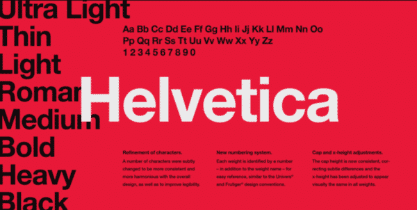
Undoubtedly, Helvetica is the most heavily used font by professionals in graphic design. Although some praise the font, many believe it is spaced too tightly.
Helvetica, which comes in various weights, widths, and sizes, is appropriate for most designs. We’ve used this typeface a lot in designs that call for a classic touch because we adore it for its professionalism and simplicity.
We use this sans-serif font for a variety of tasks, including logo designs, business card headlines, and more. This font is used by numerous reputable companies in their wordmarks and company logos, including Jeep, Panasonic, American Apparel, Target, Skype, JCPenney, and many others.
And as Vivien pleads in her 16 most overused fonts article, “Understand that you can’t always rely on Helvetica to illustrate and deliver your every message. Helvetica is not perfect for everyone and every occasion.”
You should also consider the new 2019 version, Helvetica Now.
2. Trajan Pro
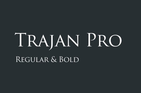
Many Hollywood movie posters feature Trajan, whether related to religion, law, marriage, class, or history. Our research shows that this elegant font will give your designs better technical adherence and a longer-lasting aesthetic appeal.
Trajan is an old-style serif typeface designed in 1989 by Carol Twombly for Adobe. The design is based on Roman square capitals for the inscription at the base of Trajan’s Column. Trajan Pro
We adore its elegant appearance. It is a good option for titles and headlines because it is sufficiently readable. You can check out the Flickr pool for more uses of Trajan.
3. Garamond Pro
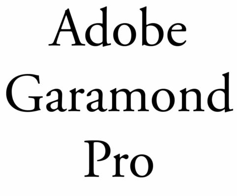
Although there are many versions of Garamond, the most used version today is the Adobe Garamond Pro, released in 1989. Garamond is a great font for magazines, textbooks, websites, and long bodies of text and was recently named the second-best font (after Helvetica) by a German publication.
This font strikes the perfect equilibrium between beauty and uniqueness by giving it an authoritative and authentic look, making it an excellent option for books, novels, and short stories. The older iteration of this typeface is still used by a few companies, including Apple, Google, Dior, Abercrombie & Fitch, and a few others.
It is worth considering because it effectively combines its modern digital feel with OpenType’s sophisticated typographic capabilities.
4. Futura

Futura is a font often used in large displays, logos, corporate typefaces, and books where small text is needed. It is based on geometric shapes (near-perfect circles, triangles, and squares), representing the Bauhaus design style of 1933. Futura has an appearance of efficiency and forwardness. Some do hate the font, though.
We appreciate the font, though, for its conceptual simplicity, elegance, and boldness. Your designs will feel more futuristic if you use this typeface in contemporary designs.
This futuristic font’s adaptability makes it suitable for designs like company logos, taglines, and novels. You can find this iconic typeface on well-known companies’ products, including Supreme, Nike, Gillette, Red Bull, PayPal, and more.
5. Bodoni
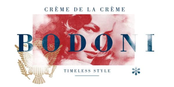
Bodoni is a great font for headlines, decorative text, and logos. Bodoni has a narrow underlying structure with flat, unbracketed serifs. The face has extreme contrast between thick and thin strokes and overall geometric construction, making it a very aesthetically pleasing font.
According to our research, this bold typeface has become very popular in the fashion industry due to its aesthetic attractiveness. This juxtaposition of thick and thin lines creates a distinctive appearance when used on posters, package designs, cover page designs, fashion logos, and other items.
This formal typeface is on renowned labels like Gucci, Vogue, Calvin, and more.
6. Bickham Script Pro
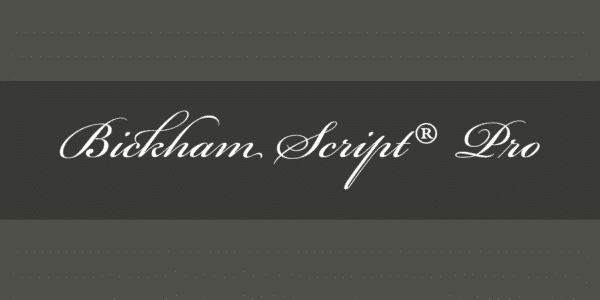
Bickham Script Pro is a font that does the job well and is used mainly for formal occasions. Cameron Moll even recommended it in his article “Typefaces no one will get fired for using.” The ‘not-so-trained’ designer usually vouch for Vivaldi instead, one of America’s most hated fonts. Another great alternative would be Sloop.
This distinctive cursive typeface is an excellent option for pictures, letters, printables, events, etc. They appear flawlessly imaginative, appealing, loving, and elegant despite their apparent simplicity.
7. Frutiger
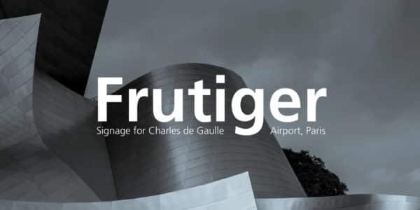
The Frutiger font family is neither strictly geometric nor humanistic in construction; its forms are designed to quickly and effortlessly recognize each character. Such distinctness makes it suitable for signage and display work, and it is often used in Web 2.0 Logos.
The full family has a warmth and subtlety that have, in recent years, made it popular for the smaller scale of the body text in magazines and booklets.
We also discovered that this humanist font was frequently used for signs at airports, pharmacies, highway signage, hospitals, educational posters, and other establishments.
This makes it appear distinct and readable at all sizes, including from a distance. In our study, we also learned that designers have long preferred this due to its clarity and legibility.
8. Sabon

Sabon is the perfect font for book text and elegant design due to its smooth nature, and it has long been a favorite of typographers and professional designers.
With its gentle curves, smooth textures, and attractive serifs, this traditional Roman typeface succeeds in being readable. With a few minor alterations, we discovered that well-known companies like Vogue and Esquire use this italic font.
See here for more great book fonts.
9. RockWell
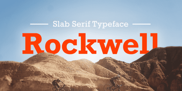
Slab serif fonts (square serif or Egyptian) are sturdy, straight-edged, and have a no-nonsense attitude. A font like Rockwell is robust and adaptable, which is why it’s always in a professional designer’s toolkit.
This Monotype font is legible and bold, just like all the other fonts mentioned above. This slab serif typeface works best for titles and headlines rather than the main body of text. You can use this professional, geometric-shaped typeface for posters, movie titles, advertising, and branding.
We discovered that this strong, robust typeface comes in light, standard, bold, and condensed variations and is widely used in advertisements and business documents. Look in periodicals like Tall Lighthouse and Guinness World Records if you want examples.
10. Proxima Nova

Proxima Nova font is an all-purpose modern sans that can give graphic design projects a very minimal and professional look.
We adore using this contemporary typeface in media because it is easy to read on screens of all sizes and has a basic, elegant appearance. We found three widths to choose from: Proxima Nova, Proxima Nova Condensed, and Proxima Nova Extra Condensed. Each width consists of 16 fonts—seven weights with matching italics.
JUSTCreative, the site you are on, uses this font for the brand.
11. JUST Sans® – Clean Modern Minimal Font

If you’re after a clean, minimal, and professional font, check out JUST Sans.
JUST Sans is a highly versatile typeface with endearing, modernist warmth, geometric legibility, and a distinctive friendly bite.
JUST Sans strikes the right balance between professionalism and friendliness. It is unassuming but lovingly expressive, technical without being obvious, and recognizable yet distinctive enough to stand alone.
Editor’s Choice: Top Professional Fonts for Design
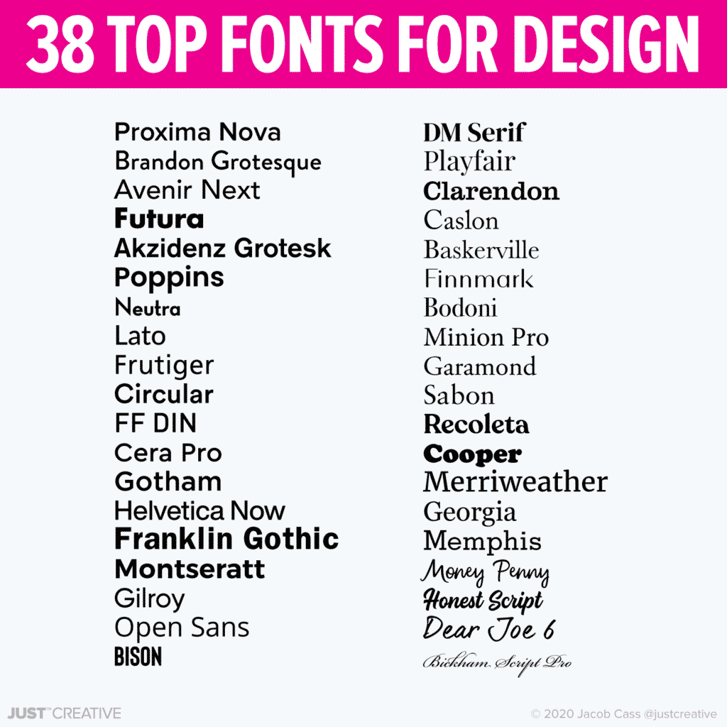
When we are choosing a font, there is a certain handful that is always top of mind. We listed them all out and came up with this list featuring 38 of our favorite fonts for professional graphic design.
Sans Serif
- Proxima Nova (Our brand’s font)
- Brandon Grotesque
- Avenir Next
- Futura
- Akzidenz Grotesk
- Poppins (Free)
- Nexa
- Lato (Free)
- Frutiger
- Circular
- FF DIN
- Cera Pro
- Gotham
- Helvetica Now
- Franklin Gothic
- Montseratt (Free)
- Gilroy
- Open Sans (Free)
- Bison (Get for 50% off)
Serif / Script / Hand
- DM Serif (Free)
- Playfair (Free)
- Clarendon
- Caslon
- Baskerville
- Finnmark (get for 50% off)
- Bodoni
- Minion Pro
- Garamond
- Sabon
- Recoleta
- Cooper
- Merriweather (Free)
- Georgia
- Memphis
- Money Penny
- Honest Script
- Dear Joe 6
- Bickham Script Pro
Fonts Used By Professionals
Choosing the right font for your designs helps you enhance and align them perfectly to match the tone and seamlessly convey the right message to the audience. In this article, we have consolidated the list of the best fonts used by professionals.
If you have chosen one of the best professional fonts mentioned above, let us know in the comments. Happy designing!
Related Posts:
- Best Canva Fonts
- Best Adobe Fonts
- Best Luxury Fonts for Design
- Best Serif Fonts for Design
- Timeless Fonts
- Stunning Font Combinations
- The Top 100 Best Fonts Of All Time
 Save this professional font post… Pin the image below!
Web Tech World


Comments
Post a Comment