30+ Timeless Fonts (Classic Fonts All Designers Should Own)
Looking for timeless fonts to add to your font arsenal? We’ve outlined the best below.
There are thousands of typefaces and more are being produced daily. It is a continual challenge for designers to select the exact typeface best suited for a project.
This article defines 30 of the most useful and classic typefaces for all design needs and occasions, as outlined in the book 30 Essential Typefaces for a Lifetime by Imin Pao and Joshya Berger.
There are 15 serif fonts and 15 sans-serif fonts, that will last your whole career!
A brief description of what each font is best suited for is provided however are not limited to this.
You may also be interested in how to choose a font and the top 100 fonts of all time.
15 Timeless Serif Fonts – Overview
- Adobe Caslon
- Adobe Garamond
- Bembo
- Bodoni
- Clarendon
- Courier
- Excelsior
- Lucida
- Minion
- Perpetua
- Sabon
- Schneidler
- Times New Roman
- Trajan
- Walbaum
15 Timeless Sans Serif Fonts – Overview
- Akzidenz Grotesk
- Avenir
- Bell Centennial
- Bell Gothic
- DIN 1451
- Franklin Gothic
- Frutiger
- Futura
- Gill Sans
- Helvetica
- Meta
- Myriad
- Trade Gothic
- Univers
- Vag Rounded
UNLIMITED DOWNLOADS: 50 Million+ Fonts & Design Assets

Download all the Timeless Fonts you need and many other design elements, available for a monthly subscription by subscribing to Envato Elements. The subscription costs $16.50 per month and gives you unlimited access to a massive and growing library of over 50 million items that can be downloaded as often as you need (stock effect & element packs too)!
15 Classic Timeless Serif Fonts
1. Adobe Caslon

Adobe is a big hitter in all things design-related, especially when it comes to timeless fonts, and Caslon is no different.
We found the font to be a solid choice for most projects. This is because of its clever combination of geometric and modern elements that gives it a certain sophistication yet an approachable appearance.
Adobe Caslon is not only style over substance. We loved how it included just about everything a discriminating typography needs: expert characters, swash letters, ligatures, alternates, and tons of period glyphs.
Another thing we appreciated about this font is its accompanying six-weight styles which when paired with each other created outstanding results.
The only thing we didn’t like is that it may not be the best fit for those in search of a more whimsical or playful font style.
Overall, we highly recommend Adobe Caslon to anyone looking for a versatile and high-quality font.
From journals and magazines to business and corporate communication, it will handle anything that comes its way.
2. Adobe Garamond

If you are a fan of contemporary-style fonts and want to add a timeless feel, then Adode Garamond is definitely worth a look.
As professional creatives, we were thrilled with how this font managed to maintain legibility at all sizes. Its scooped serifs had an easy reading feel for both longer and shorter text bodies. Not to mention its medium-contrast and flag-shaped top look that was truly impressive.
What we loved most about Garamond are its multiple font weights and styles that provided us with great flexibility.
We used it for all sorts of designs, and each time were blown away by how effortlessly it incorporated into any template. The possibilities are truly endless with this one!
However, bear in mind that the stylistic alternates of Garamond can only be accessed through special design software. So, if you like to keep things simple, fonts like Anko may come in handy.
But overall, we would highly recommend Garamond to anyone looking to add character to their design projects.
3. Bembo
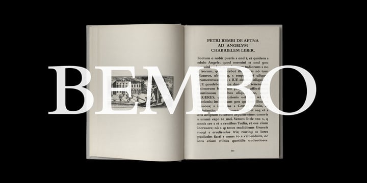
Endearing, warm, and expressive – this Monotype creation is one of the most tradition-heavy and history-rich options in our line-up.
One thing we liked about Bembo is its attention to historical accuracy. This font is inspired by the Italian Renaissance period, and its hand-carved letters are particularly modeled to replicate the era’s archival look.
Our personal experience using Bembo has been fantastic. The font perfectly balances out the counter elements, making it truly a delight to work with. It is both friendly and serious, technical but overt, and neutral yet warmly expressive.
We also appreciated its old-style figures, alternate caps, and multiple weights, which worked just as great on textbooks, posters, billboards, and much more.
However, one thing we didn’t like about Bembo is that it does not include a WOFF file, which makes it unsuitable for use on web pages.
In concise, Bembo is an excellent all-purpose font that we highly recommend to anyone looking for a beautiful and historically-accurate visual solution.
4. Bodoni

Sturdy and a little mechanical, Bodoni is the answer to all your branding and professional needs.
We used it in several projects, such as titles, headlines, and body text, and it performed exceptionally well.
The bold letters and elegant curves accounts for the font’s enviously timeless position. When serifs or sans serifs are not the talk of the day, Bodoni still feels cutting-edge and relevant.
One thing we particularly enjoyed about Bodoni is its versatility. Containing a listing of 261 glyphs, alternates, ligatures, and other helpful elements, Bodoni allowed us to create unique designs that truly stood out
Just be aware that accessing these variants requires professional design software, and the font may seem a bit finicky to use at first. But, if you wish to move away from these restrictions, there are plenty of other options, like Baskerville, that you can try.
Overall, Bodoni is a must-have font for any professional creative looking to add a sophisticated flair to their projects.
5. Clarendon

Looking for an iconic typeface that has proven its credibility throughout time? If so, look no further than Clarendon.
As professional creatives, we instantly fell in love with Clarendon’s geometric forms and seven styles that impart flexibility and simplify designing.
Its “no fun, all business” vibe is perfect for dictionaries, headlines, and any branding project where you want to convey your message loud and clear.
We were also impressed by the fact that it comes in multiple file formats, including a Web font, giving us great flexibility in terms of compatibility with different software applications.
And honestly, what’s more to ask for?
6. Courier

Keep things slick and smart with this timeless font by ParaType Studios.
We had the pleasure of trying Courier, and it was so much fun to work with. With letters that are just the right width, neither too slender nor too bulky, Courier turned out to be a good fit for all our projects.
We particularly loved using it on word processing, technical documentation, and tabular materials.
Our favorite part about this extensive family pack is that it is available in four styles (regular, italic, bold, and bold italic) with small caps, ligatures, alternates, and a whopping 1000+ glyphs.
However, keep in mind that the spacing between certain letters can turn out to be a bit off at times, compromising the readability. But, if you wish to steer clear of such readability issues, keep an eye on Caligor.
7. Excelsior

A little fun fact about Excelsior… the designer took extra care in maintaining its legibility by consulting several optometrists regarding optimal legibility.
We experienced this attention to detail first-hand. We used Excelsior in many different sizes, and never once did it turn out too “crowded” or illegible. Using the font on proposals, reports, and newsletters presented us with some truly mesmerizing results.
Another plus point about this font is its adaptability. We were impressed by how extensive the font family was. It comprises lots of alternates and includes three weights, Roman, Bold, and Italic. The Bold version really did a wonderful job of enhancing the text and making it stand out.
However, the winning feature for us was Excelsior’s extensive range of stylistic alternates and ligatures that allowed for a higher degree of customization and creativity.
Designers can experiment with them to create visually-striking masterpieces.
Overall, we highly recommend Excelsior to designers looking to create high-quality, visually-striking masterpieces.
So give it a try and see for yourself!
8. Lucida

Lucida has been overshadowed by other popular fonts like Bodoni, Bembo, and Clarendon for years. But recently, it has started gaining the attention it deserves and has come to define the timeless font foundry due to its commercial success.
It impressed us with its two beautiful style variations that we mixed and matched to add more flavor.
From low-resolution printing to social media art materials, we used it in multiple ways and were glad to find that it enhanced each of their visuals.
Another thing we loved about Lucida is its distinct, easy-going vibe that sets it apart from other similar typefaces. It possesses an undefined quality that people respond to.
However, one thing we didn’t like about Lucida was that its casual vibe didn’t work well with our business-related designs, as the seriousness behind the message tended to get lost.
In short, Lucida is an excellent “no-frill” font that we suggest all businessmen and tech heads add to their creative arsenal.
9. Minion

Want to provide the entire brand experience with a unique touch? Minion has got you covered!
One thing we liked about Minion is how it was primarily created for traditional texts but yet also adapts well to the current times. It depicts the richness of the late baroque forms through the cover of modern text formats, a quality that we were most impressed with.
We were also amazed by the font’s aesthetics when we used it on packaging, logos, and headers.
But, what we didn’t like was that the clarity was only limited to smaller text bodies. This was mainly because of its too-tight kerning. Fret not, as this minor inconvenience is easy to solve using other great alternatives, such as Wolfgang by Aronetiv.
To sum it up, if you’re searching for a font that’s both classic and modern, Minion is the way to go.
10. Perpetua

Perpetua is another gentle serif font where readability is paramount.
We liked how it featured enough space and a stunning x-height to enhance readability over long distances – it was a dream come true for our printed designs.
Perpetua makes for an exceptional addition to your roster of body fonts. We can easily imagine seeing it on pages of novels, displays with fine lettering, and chiseled texts.
What we are particularly fond of is its timeless elegance, which encapsulated the true essence of our typographic conventions. And that too without looking outdated.
We weren’t thrilled to see how its Tilting Bold version caused slight distortion of the letters and didn’t achieve the same crisp and clean appearance as other versions.
The font is available in seven styles, including symbols, font pairings, and alternatives, providing us with many different ways to add depth and dimension to our creations.
Download Perpetua right now to travel through the timeline with style.
11. Sabon
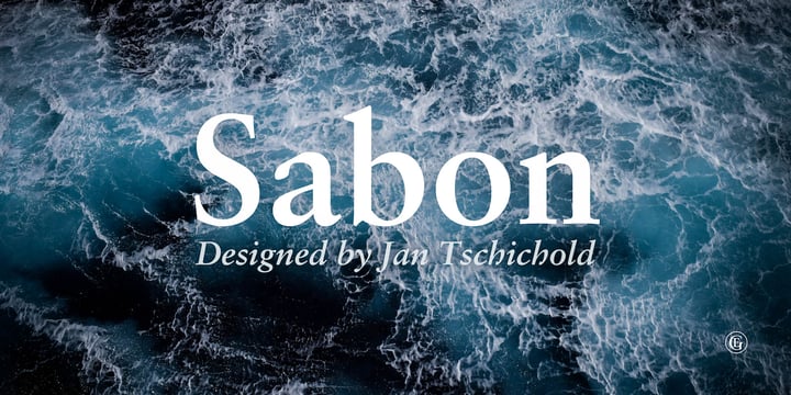
Sometimes less is more, and this typeface by Linotype is here to prove this.
As professional creatives, we loved its carefully-crafted letters that helped us achieve a good reading pace and created a pleasant reading experience. Books and corporate communication are a few of the many projects where you can use Sabon.
Another thing we were impressed by is Sabon’s four weights that worked great, both as standalone and when paired together, producing outclass results either way.
However, what we liked the best about Sabon is its simple nature that does not overshadow its surroundings but can shine alongside the right composition.
The only thing that we disliked about this power pack is its lack of multilingual support, and therefore, we had to take help from other more internationally-designed fonts for our “”non-English”” projects.
Overall, we recommend Sabon to anyone looking for a modern, stylish font to elevate their literature and education-related projects.
It’s straightforward, versatile, and delivers top-notch results every time.
12. Schneidler

Like any business card, this font is full of smooth edges, uniform shapes, and just the right dose of attitude.
Designed by F. H. Ernst Schneidler in 1936, Schneidler has all the necessary elements to enchant the audience.
We liked how its clean, stencil letterform created an outstanding balance of strength and style and accurately represented the seriousness of our design.
We enjoyed using Schneidler on novels, resumes, and all sorts of professional and educational projects.
Another thing we were impressed by is the fact that Schneidler contains numerals, symbols, ligatures, and a complete set of characters, ensuring its functionality.
While these ornaments paved the way for easier modifications, it took us some time to get a hang of them. We vouch for Cushing Two and similar user-friendly fonts in such instances.
But overall, we would definitely recommend Schneidler to anyone looking to level up their design game.
13. Times New Roman
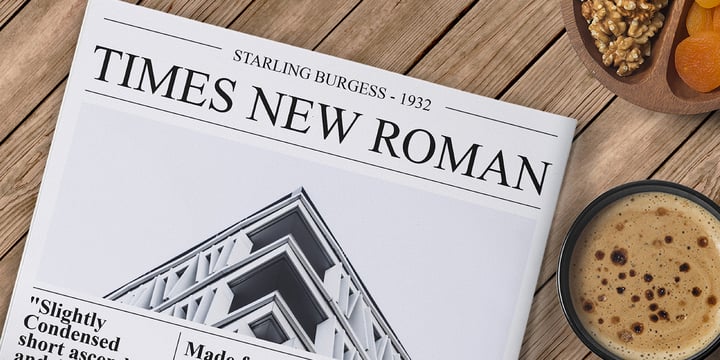
Of all the serif fonts available today, Times New Roman is the one that reigns supreme. Commissioned by the Times in 1931, this workhorse has enjoyed popularity ever since its birth. It is truly timeless!
This unique personality of Times New Roman is what truly won us over. On the one hand, its geometric characters worked great for our in-your-face designs. On the other, its humanistic roots managed to maintain readability at all sizes.
What we particularly liked about this font is that it didn’t just rely on nostalgia to catch our eye. It had twelve very attractive condensed, Roman, and bold styles to effectively get the job done – the first, in particular, looked fantastic when we incorporated it into our vintage-themed designs.
In conclusion, Times New Roman is an obvious choice for anyone seeking to create simple yet sophisticated projects.
Use it in newspapers, magazines, and corporate communication – anywhere you can shine a spotlight on its sleek lines is a good start.
14. Trajan

In search of a font whose beauty and clarity come across in various projects? This crisp typeface by Adobe is all you need!
We liked how its modern design combined with its nod to Roman art made Trajan suitable for an extensive range of our projects. Bold, tall, and brilliant, it looked great when used on posters, magazines, and books.
However, the standout feature for us was its supporting ligatures and stylistic alternates that enabled swift customization.
These variants allowed us to try our hands on different styles and make full use of this creative freedom.
Just make sure to download professional software to access these alternates.
Our advice is to add Trajan to your design toolkit to elevate your creations from something ordinary to simply outclass.
15. Walbaum
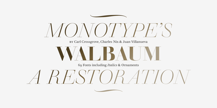
Who says the best timeless fonts always have to be serious? There’s nothing like an elegant, approachable serif to bring out the playfulness in your work.
Walbaum exudes the warmth missing from comparable typefaces like Sabon and Trajan, feeling effortlessly friendly and exciting.
We were thrilled on using its cap heights and intricate detailing, which allowed us to create a vast number of designs without compromising the aesthetics.
Another thing we liked is its availability in OpenType font format and included range of stylistic options. From lining, proportional, and tabular figures to ligatures, fractions, and over 600 glyphs, it has every element required to start and complete a project.
What we didn’t like is the fact that this font requires certain applications to use these features.
But that’s no big deal! Try other fonts like Felis to get your hands on these ornaments without installing any tech-savvy programs.
In summary, Walabum Font is a bright and cheery font that we highly recommend based on our amazing first-hand experience.

Download all the Fonts you need and many other design elements, available for a monthly subscription by subscribing to Envato Elements.
The subscription is just $16 per month and gives you unlimited access to a massive and growing library of 400,000+ items that can be downloaded as often as you need (stock photos too)!
15 Classic Sans Serif Timeless Fonts
1. Akzidenz Grotesk
-01.png)
This sans serif typeface was first published by Berthold and released in 1896. Akzidenz Grotesk is a classic font that looks perfect in books, magazines, and websites.
We particularly liked Grotesk’s flat contours and thick structures which ensured that the message of our design got out with a boom. Another thing we appreciated about this font is that all its characters are unique and each one looks great. None of them has the same noise.
We were also impressed with how carefully its kerning and metrics are designed to suit the best reading experience a sans serif typeface can provide.
This font brings a lot to the table: from OpenType fractions to 30 different styles, and these additional features surely helped us lend an authentic touch to our creations.
Whether you’re a designer looking to add a dash of timeless spirit to your work or a business owner wanting to elevate your brand, Akzidenz Grotesk fits the bill.
So, go forth and use it to bring the much-needed charm to your creations.
2. Avenir
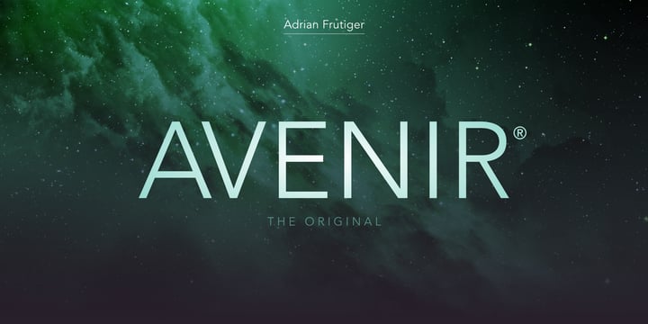
This Linotype offering is a best seller on My Fonts. And on experimenting with it, we find out all the whys behind this title.
Thanks to its sharp, geometric letters with portend aesthetics of the 21st century, Avenir helped us in delivering out-of-the-box visuals that gave our designs an edge over the competitors.
One thing we loved about it was its modest curves and gradual width changes that lend a natural, human touch to our work. We particularly loved using Avenir on newsletters, brochures, and souvenirs.
Another impressive feature of Avenir is its multiple file formats, ample kerning, and various styles that further improved the font’s functionality and provided us with lots of flexibility regarding the design aspect.
However, on the flip side, Avenir didn’t work as gracefully for shorter body texts. Hence, you will have to look for other fonts for such needs. A quick piece of advice: try starting with the super flexible Hans Kendrick SE!
In summary, Avenir is a definite pick for any creative endeavor. Its modern look and bold design are sure to impress!
3. Bell Centennial
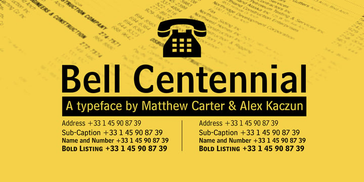
Bell Centennial is a one-of-a-kind font that was created to solve contextual problems. Small, pristine, and functional, this typeface has myriad uses.
We enjoyed using it for newspaper designs, novel pages, and even business branding.
We particularly liked its distinct nomenclature that is specific to the phone directory hierarchy. These names guided us through the process by simply suggesting us the best-fitted style for the purpose.
Another thing that blew us away was the font’s PUA-encoded numerals and punctuation and multilingual characters which increased its versatility and made it a suitable option for local and global designs.
Overall, Bell Centennial is an excellent investment for those wanting to lend a delightful touch to their formal designs.
Pure indulgence – that is what we are talking about here!
4. Bell Gothic

Bell Gothic is another typeface that pays homage to phone books and directories. This precursor of Bell Centennial was specifically designed for AT&T in 1938. Bell Gothic served as America’s standard directory typeface for forty years. Proves its credibility, right?
We were impressed by the font’s space-saving design, featuring uniform and moderate-weight lines. It was a delight to use it for listings, catalogs, and other smaller text chunks.
On experimenting with Bell Gothic, we found it straightforward to install and use on PC and MAC devices. Moreover, its variants are accessible through multiple basic software.
What we didn’t like is its lack of PUA-encoding and multilingual support, which can limit its fluidity to an extent.
All factors considered, we are convinced that Bell Gothic is a fantastic typeface. Whatever you use this dedicated font for, it will always understand the assignment and meet your expectations.
5. DIN 1451

The star stellar quality of all sans serif fonts is their ease of reading, writing and understanding. Keeping up with this standard, Din 1451 was released by Linotype for a variety of purposes.
Initially, this typeface was strictly used by Germans for traffic signs, administration and technology businesses. However, given its popularity and legibility, it gradually paved its way into the world of marketing and branding.
Our favourite part about Din 1451 is that it contained three different styles and supported numerous languages. While the font looked extremely graceful and formal on official documents, we were not particularly a fan of its sombre look.
If you are looking for a font to bring life to your design and make it seem more approachable, we suggest skipping on Din 1451 and instead picking something similar to the Sol De Jalisco typeface.
6. Franklin Gothic

Are you in dire need of a font that easily fits into compact spaces without looking odd or out of place? If yes, then the Franklin gothic sans serif script is exactly what you need!
As creative experts, we found its thin characters with smooth, round strokes and a robust outlook ideal for various project styles.
However, the best part for us about the Franklin Gothic lied in its subtle stroke contrasts and monotone design. Both of these qualities made this typeface a suitable choice for use in newspaper articles, advertisements and posters.
After experimenting with the font ourselves, we were impressed by its other commendable features including its multi-lingual support and alternate characters for added versatility with various design templates.
All things considered, we are completely in love with the modern look of Franklin Gothic and consider it to be the most widely pick in the bunch.
7. Frutiger

Let’s be real, every designer wants their sign board to stand out in a crowded room and grasp the attention of the reader right away. This becomes even more important when the board contains important directional instructions for the audience.
We loved how Frutiger countered this specific issue and guaranteed maximum visibility of all projects we used it on.
The Frutiger family consists of various weights, character sets and supported accents.
However, what stood out the most to us was its unique font style. The characters were not strictly geometric or calligraphic but instead had a prominent, readable and easily recognizable feel.
In our experience, while Fruitger is an exceptional choice for display and sign boards, its soft and warm texture goes well with the secondary body text of magazines and pamphlets as well.
Considering its versatility, Frutiger is undoubtedly one of the most flexible fonts that we have found until now.
8. Futura
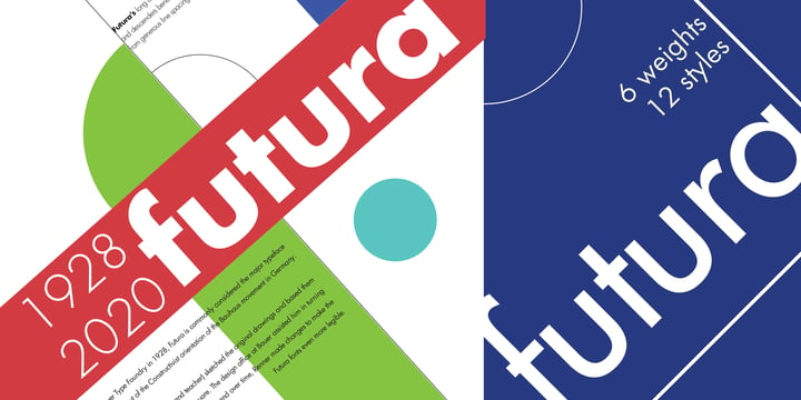
Next up, we have an evergreen timeless font that fits perfectly with the art styles of all generations. Futura started off as rough sketches of various shapes and with time, evolved as a sleek, geometric, functioning typeface.
Taking after its name, Futura contains futuristic and modern letters in up to 22 different styles and weights.
Not only this, but we also particularly liked how the font offered Latin, Greek and various other language characters along with their alternates and font pairings. The thing we admired most is the generous line spacing between the characters, providing a neat, crisp finish.
However, we didn’t like the fact that Futura sometimes looks too formal on casual posters and instead recommend you to consider the Bennet display instead.
Overall, we highly recommend going with Futura if you are working on a professional project that is in dire need of refinement.
9. Gill Sans

Gill Sans is the trademark typeface of the brand Monotype and is heavily inspired by the signage of the London
Underground Railway. This timeless sans serif font has a vast family of multiple styles, languages and character sets.
If you are an admirer of British culture, like us, then you are bound to be enchanted by the character design of Gill Sans.
We particularly liked its historic style of lettering with hints of geometry for a modern yet playful feel. Moreover, it also featured Gill’s famous signature flared, eyeglass lettering!
Our experience with Gill Sans was flawless for use on signages, display boards and secondary text. Lastly, we were impressed by its compatibility with PC, Mac and as a hybrid CD for both platforms, making it a suitable candidate for all types of designers and digital artists.
10. Helvetica
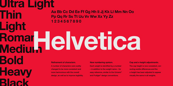
Following Monotype’s legacy, let’s take a look at another one of their reputable timeless sans serif fonts. Helvetica means Swiss in Latin and has been linked with the Swiss presswork from the 1950s until the 1960s.
This family pack consists of 30 different font styles and impressive OpenType features. What we admired the most about Helvetica is that it presented information without beating around the bush with extravagant characteristics.
We found Helvetica to be an adequate fit for books, magazines and newspapers, all thanks to its polished, neutral and modern letters. These get your point across to the reader right away.
At the same time, we understand that Helvetica might be too formal and stoic for certain occasions. In such cases, our team of experts recommend going for a more fashionable typeface, similar to the New Ayres font style.
All in all, it truly is a great font to consider for your creative projects.
11. Meta

We were thrilled to get our hands on Meta and suffice to say, it didn’t disappoint us in any way. Meta is a carefully designed timeless font that seems to catch the eye of every onlooker with its charm.
Its letters with sharp edges and open terminals added a contemporary and welcoming feel to our masterpieces.
After using the font with various design templates, we can confidently deem Meta perfect for advertisements, websites and branding.
Moreover, its geometric structures, 1197+ glyphs, and multilingual support improved the quality of our formal documents and magazine layouts by a huge degree.
12. Myriad

If you are looking for a font that looks equally attractive as both the display and body text on a project, then look no further than Myriad!
Myriad is a sans serif Adobe font that contains additional glyphs supporting Greek, Cyrillic and other Latin-based languages.
For us, it proved to be the perfect blend of humanistic and modern typography. It featured sharp, clean shapes, precise characters and kerning pairs that provided added flexibility, creativity and control over the design.
Another aspect of Myriad that came in handy was its included set of extended widths in a wide range of weights.
Suffice to say, Myriad lived up to our expectations by providing an easily readable and usable font for a variety of our projects including all-purpose media and large displays.
We highly recommend giving it a try!
13. Trade Gothic
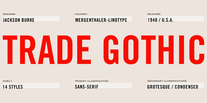
When you think about timeless fonts, you think of a monotone, simple design that focuses on the information more than the aesthetics.
Trade Gothic by Linotype offered us the best of both worlds with its sleek, neat lettering with an earthy feel. We were big fans of its wide collection of languages including Romanian and French.
Although the font paired well with most design templates, we specifically liked how it looked as newspaper headlines, advertisements and media posters.
The only drawback that we found while using Trade Gothic was its lack of multilingual support that is otherwise found in other popular sans serifs. If a multiple language supper is significant for your artwork, you can try opting for the Secretary typewriter typeface instead.
In conclusion, Trade Gothic is a fantastic font for all global designs that you wish to make stand out.
14. Univers

Univers started off as a dream to fulfil all typographic needs and soon evolved from rough sketches into the advanced, attractive form it is now.
It is a collection of steady, clean letters that drip off richness and proficiency. However, what helped us shortlist this font in our list is its diverse weight and style collection.
Be it for old-style, modern, slab or casual use, Univers had just the right weight we needed to transform our project into a masterpiece right away!
We particularly loved its adaptable nature and tons of weights and alternates.
Univers is definitely one of our top picks for designing creative typographic projects along with writing longer, secondary text. Unleash your true potential with Univers’ limitless features and multiple accents!
15. Vag Rounded
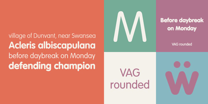
Last but not least, we have a lively yet professional timeless typeface to improve the overall visual appeal of your designs.
Just like its name, Vag Rounded is an all-rounder sans serif script family that consists of four different weights ranging between thin, bold, and black.
The typeface featured geometrically aligned, smooth edges and curved terminals that gave a welcoming and warm energy to our designs and proved to be ideal for logos and typographic projects.
We also tried pairing Vag Rounded with other reserved sans and sans serif typefaces and found the results to be extraordinary! It maintained a cordial balance between a friendly and formal outlook and hence, didn’t turn out too showy.
It also had OpenType features and multilingual character sets that further allowed us to make the most out of it.
We weren’t thrilled to see how some of its weights didn’t turn out to be as clean and clear as the regular version.
But overall, we highly recommend Vag Rounder to anyone looking to create eye-catching and attention-grabbing professional designs.
Related Posts:
- Best Luxury Fonts for Design
- Best Serif Fonts
- Best Classic & Elegant Serif Fonts
- Best Font Combinations
- The Top 100 Best Fonts Of All Time
Classic Timeless Fonts Summary
And with that, it is time to wrap up this Timeless font list. Regardless of where you are in your design career, you are now open to a few great choices. And no matter what kind of branding and design you do, you can rest assured knowing that these classic fonts will never go out of style and always be there to save the day.
Do you agree with our Timeless font list? Let us know in the comments below!
Web Tech World


Comments
Post a Comment