10+ Best Fast Food Logos for Design Inspiration
Are you seeking design inspiration in the world of fast food logos? Look no further!
We have carefully curated a collection of the best fast food logos that are sure to ignite your creative spark. These logos exemplify the art of capturing the essence of the fast food industry while leaving a lasting impression on customers.
From clever typography to iconic symbols, each logo showcases the creativity and skill of the designers behind them. Join us on this visual journey and explore the exceptional craftsmanship and innovative concepts that make these logos stand out from the rest.
Get ready to be inspired and uncover the secrets behind these remarkable designs that have helped shape the fast food landscape.
Top 10 Famous Fast Food Logos – Overview
- Burger King
- Chick-fil-A
- Chipotle
- Dunkin’ Donuts
- KFC
- McDonald’s
- Pizza Hut
- Popeyes
- Taco Bell
- Wendy’s
Scroll on for the full list.
15 Best Fast Food Logos
1. Burger King
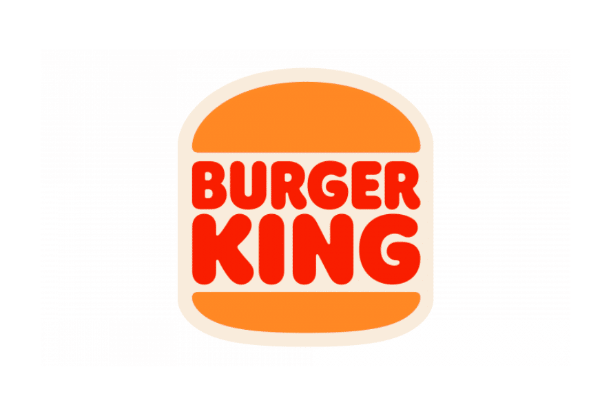
Burger King has swiftly ascended to become one of the world’s most recognizable fast food chains. Established in 1954, Burger King specializes in serving mouthwatering fast-food burgers, offering a formidable competition to industry giants like McDonald’s.
A symbol of culinary prowess, the Burger King logo is an artistic masterpiece. Featuring a captivating red wordmark, intricately crafted to command attention, it showcases the brand’s fiery passion for delivering extraordinary dining experiences. Nestled within the design, two cleverly designed orange shapes mimic perfectly toasted buns, symbolizing the brand’s dedication to crafting burgers that are a true delight to behold.
Recently, Burger King unveiled a fresh iteration of its iconic logo, embodying simplicity and sophistication. Building upon the success of its predecessor, which reigned supreme from 1999 to 2020, this new evolution represents the brand’s commitment to continuous progress and innovative thinking.
2. Chick-fil-A

The Chick-fil-A logo incorporates clever elements that reflect the brand’s commitment to high-quality chicken. The intentional capital “A” in “Chick-fil-A” represents the “grade A” designation, symbolizing the top-notch chicken used in their renowned sandwiches.
Founder Truett Cathy crafted the sandwich using whole, boneless 100-percent real chicken, a quality standard that persists to this day. In the early 1960s, when the sandwich was created, people recognized and valued such a superior grading system.
Contrary to the Original Chicken Sandwich recipe, the Chick-fil-A logo has undergone significant changes throughout its nearly six-decade history. Originally, the logo featured an additional “l,” a lowercase “a,” and the tagline “Best Thing That Ever Happened To A Chicken.” However, over time, it evolved into a recognizable design featuring beak, eye, and crest feathers, introduced in 2012 and still cherished by customers today.
3. Chipotle

Chipotle, a popular American brand known for its delicious Mexican-inspired cuisine, entered the food industry in 1993 with a mouthwatering dish. However, its initial logo design lacked the appeal expected of a food brand. In 2009, Chipotle revamped its logo to better represent its flavorful and appetizing food offerings.
Presently, Chipotle boasts one of the most enticing and vibrant logos globally, capturing the essence of the brand’s commitment to wholesome, natural, and organic food.
The logo features white, symbolizing cleanliness and hygiene, red representing passion and zest, and brown connoting a healthy lifestyle. This emblem resonates perfectly with a food chain dedicated to serving all-natural ingredients.
The fiery Chipotle logo has found across various marketing channels. Its timeless layout and captivating appeal make it sizzle on billboards, television shows, banners, websites, merchandise, and other essential promotional platforms, enticing customers with its delectable dishes.
4. Dunkin’ Donuts

The vibrant and energetic logo of Dunkin’ Donuts perfectly represents the brand’s core focus on producing and serving donuts and coffee. The color palette chosen for the logo creates a warm and welcoming atmosphere, evoking a sense of kindness.
Looking at the logo, one can almost taste the sweetness of the chain’s delectable products, with the bright shades reminiscent of the luscious glazing on their donuts.
5. KFC

KFC’s logo history reflects its evolution as a global fast-food brand. The original logo from 1952 featured the words “Kentucky Fried Chicken” in a bold, stylized font along with an image of Colonel Harland Sanders.
In 1978, the logo introduced red and white stripes, emphasizing tradition and nostalgia. In 1991, KFC modernized its logo, abbreviating to “KFC” and incorporating a streamlined design with a red and white circular shape.
The image of Colonel Sanders remained, portraying the brand’s heritage. While the primary logo has remained consistent, KFC has adapted variations for specific campaigns and promotions. Overall, the logos have showcased KFC’s association with its founder and its evolution as a leading fast-food chain.
6. McDonald’s

The distinctive symbol of McDonald’s features a stylized letter “M” formed by two Golden Arches, which holds significant meaning for the company. The symbol not only represents the name of the brand but also pays homage to its rich historical legacy.
The iconic arches were inspired by the original design of the early McDonald’s restaurants, where the arches formed a prominent structural element. Over time, the symbol has become synonymous with McDonald’s and is instantly recognizable worldwide.
Its enduring presence reflects the brand’s enduring success and continued evolution in the fast-food industry.
7. Pizza Hut

Since 1967, the Pizza Hut logo has featured an abstract element that resembles a hat, signifying a distinct brand identity. This hat-shaped symbol holds multiple meanings for the company. Firstly, it represents protection and safety, aligning with the theme of delivering quality food and service.
Secondly, it cleverly incorporates the word “hut” from the company’s name, reinforcing brand recognition. The warm and loving red color of the hat in the Pizza Hut logo symbolizes the chain’s commitment to creating a welcoming experience for customers.
Additionally, the hat’s design draws inspiration from the original Pizza Hut building, envisioned by Richard D. Burke, which featured a roof of the same distinctive shape. Thus, the logo not only conveys brand values but also pays homage to the brand’s architectural heritage.
8. Popeyes

The brilliant orange hue of the Popeyes logo radiates warmth and vitality, while the style and placement of the wordmark’s letters suggest stability and professionalism.
Despite its simplicity, the logo remains highly recognizable to millions of people. The playful and welcoming nature of the logo’s color palette evokes a promise of delicious food and a delightful dining experience, enhancing the brand’s appeal.
9. Taco Bell

The Taco Bell logo features a prominent bell positioned above the sleek and contemporary lettering, rendered in a combination of purple and white hues. Serving as both a visual representation of the company’s name and a symbol, the bell grabs attention and beckons people in.
Its distinctive presence adds an inviting touch, reflecting Taco Bell’s brand identity and its ability to draw customers through its doors.
10. Wendy’s

The Wendy’s logo, featuring the endearing image of a red-haired girl, has become an iconic representation of the restaurant chain’s inviting character. With her friendly smile and vibrant personality, the girl embodies the warm and energetic atmosphere that Wendy’s strives to provide to its customers.
Moreover, the inclusion of the handwritten word “Mom” delicately positioned along the collar of the girl’s shirt not only adds a touch of nostalgia but also conveys a message of maternal care and homestyle comfort, reinforcing Wendy’s reputation as a place where families can gather and enjoy a satisfying meal.
11. Hungry Jack’s

Hungry Jack’s, a fast food restaurant chain in Australia, has a visual identity that bears similarities to the well-known American brand, Burger King. However, it is important to note that Hungry Jack’s is owned by a separate company called Competitive Foods Australia.
Hungry Jack’s made its debut in the Australian market during the early 1970s, marking its inaugural restaurant opening in 1972. The choice of the name “Hungry Jack’s” serves as a homage to the respected founder of Competitive Foods Australia, Jack Cowin, commemorating his significant contributions to the company. While the logo of Hungry Jack’s closely resembles that of Burger King, it has undergone fewer redesigns and presents a simplified version of its American counterpart.
The initial logo of Hungry Jack’s, introduced in 1971, remained unchanged for about two decades. It mirrored the logo used by Burger King during that period, featuring two brownish buns enclosing two-leveled red lettering in a rounded sans-serif font, with the word “Jack’s” enlarged. In 1995, the logo underwent a refinement, with a flatter and brighter color palette. The brown buns were replaced with a vibrant orange shade, and the typography was modernized, featuring balanced letter shapes with rounded corners that maintained a friendly and welcoming aesthetic.
In 1997, Hungry Jack’s logo experienced another redesign, aligning with the updated visual identity of Burger King. The colors and shapes were further refined and cleaned up. The letters got significantly thicker and took on a traditional shade of red, but the buns maintained their constant yellow color. Additionally, an alternate version of the logo was introduced, featuring an outlined emblem set against a solid red background.
It is worth noting that although Hungry Jack’s logo draws inspiration from Burger King’s visual identity, the Australian chain has developed its own distinct branding within the country’s fast food market.
12. Cinnabon

Cinnabon underwent a redesign of its visual identity in 2016, resulting in the logo that is currently recognized today. The updated logo showcases a deep blue badge with sleek lines and distinct peaks, featuring a double outline that adds visual depth.
The logo incorporates a custom, sophisticated serif typeface for the white wordmark. Notably, the initial letter “C” captures attention as it is enlarged and its tail subtly curved to resemble the iconic shape of Cinnabon’s delectable cinnamon roll.
This thoughtful design element further reinforces the brand’s association with its delectable baked goods, creating a cohesive and visually appealing logo.
13. Dairy Queen

Dairy Queen underwent a redesign of its visual identity in 2007, marking a significant change in its logo. The iconic lip-shaped badge saw alterations in its lettering, adopting an italicized serif typeface, with the letter “D” connected to the letter “Q.”
The previous calm pink color palette was replaced with a vibrant shade of red, injecting a sense of boldness and energy into the logo.
Furthermore, the logo underwent notable enhancements with the addition of two distinct elements. An arched orange line was introduced on the upper section, accompanied by a complementary blue line at the bottom.
These additions not only enhance the visual appeal but also contribute to the overall composition of the logo, creating a more captivating design.
These updates brought a fresh and contemporary look to Dairy Queen’s visual identity while retaining its recognizable and iconic features.
14. Denny’s

In 2002, Flagstar Companies, which had undergone a name change to Advantica Restaurant Group, rebranded itself as Denny’s due to the profitability of its restaurant division.
The updated logo of the company and restaurant chain embraced a return to the vibrant red color, with a simplified design that eliminated multilayered substrates.
The name “Denny’s” was rendered in bold letters, gently curved to form an arch, symbolizing the welcoming and inclusive nature of the establishments and their widespread presence globally. While the main logo remains consistent across different countries, minor modifications are made to cater to specific regions.
For instance, in Canada, a maple leaf replaces the apostrophe, showcasing a nod to the country’s national symbol. In the United States, slogans such as “See you at Denny’s” or “Real breakfast 24/7” are frequently incorporated alongside the logo, emphasizing the brand’s commitment to providing a reliable destination for satisfying meals at any time of the day.
14. Krispy Kreme

Krispy Kreme’s logo has indeed undergone several changes throughout its history. The original logo, introduced in the 1930s, featured the brand name written in a bold, rounded font with the letter “K” stylized to resemble a doughnut. This iconic design remained largely unchanged for many years.
The logo was slightly updated by adding a beautiful border that neatly encircles the wordmark. This modification aimed to enhance the visual appeal of the logo while maintaining its recognizable elements.
In the 1960s, Krispy Kreme introduced a more streamlined logo design. The brand name was presented in a sleek sans-serif font, with the word “Krispy” in lowercase and “Kreme” in uppercase. This iteration reflected a more modern and sophisticated approach.
In the 1990s, Krispy Kreme underwent a significant logo redesign. The new logo featured a bold and prominent font for the brand name, with a scripted “Krispy” and a bold sans-serif “Kreme.” This updated design aimed to convey a sense of quality, freshness, and indulgence.
In recent years, Krispy Kreme has further refined its logo to align with contemporary design trends. The current logo features a simplified presentation of the brand name, with a slightly modified font and a distinctive green and red color palette. This iteration maintains the recognizable elements of the original logo while giving it a modern touch.
These changes in Krispy Kreme’s logo design have occurred over time, reflecting the brand’s evolution and adaptation to current design aesthetics.
Related Posts:
- Best Car Logos
- World’s Best Logos
- Logo Design Resources (Free and Premium)
- Logo Design Books
- What Makes A Good Logo
- Best Fonts For Logos
- How To Design A Logo
- Logo Design Cost
Famous Fast Food Logos Summary
The world of fast food logos is a fascinating and ever-evolving landscape. These famous logos have become iconic symbols of our modern culture, representing not only the brands they belong to but also the values, memories, and experiences associated with them. Through careful design and strategic branding, these logos have captured the attention and loyalty of millions of customers worldwide.
Each fast food logo tells a unique story, conveying the essence of the brand and creating an emotional connection with consumers. From the golden arches of McDonald’s to the distinctive red and white stripes of KFC, these logos have become instantly recognizable, and ingrained in our collective consciousness.
Beyond their visual appeal, fast food logos have played a significant role in shaping the success and popularity of their respective brands. They have served as powerful marketing tools, attracting customers and fostering brand loyalty. The logos have been adapted and refined over the years, keeping up with the changing times and consumer preferences, while still maintaining the core identity of the brand.
Moreover, fast food logos have transcended geographical boundaries, becoming global symbols of fast-paced lifestyles, convenience, and indulgence. They have become synonymous with quick, affordable meals, offering a sense of familiarity and comfort in a fast-paced world.
Web Tech World
Comments
Post a Comment